To recap, last week we tested our lo-fidelity 1.0 prototype. This prototype was used to test only the content of our design journal with two user groups – those with high familiarity with DFA and those with low familiarity with DFA.
This is a snapshot of what lo-fi 1.0 looks like:
Feedback on lo-fi 1.0: Our team consistently heard from both test groups that our text was too abstract and used a lot of inaccessible language.
Resulting action: We went through our content and looked at the words that our test users said they had no context for — if we could scrap the word and replace it with a more accessible word or phrase, we did; if we couldn’t scrap the word, we put it in a glossary.
We then took our iterated content and packaged it into layout.
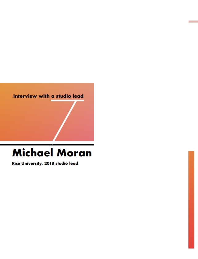
This is a snapshot of what mid-fidelity 1.0 looks like (same piece as earlier, plus iterations):

We iterated one more time, just focusing on layout.
This is a snapshot of what mid-fidelity 2.0 looks like (still the same piece, more iterations):


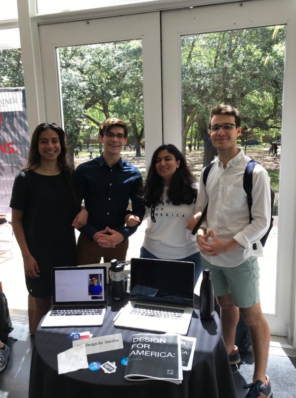
We then presented our mid-fidelilty 2.0 at “Journals and Java”, a Rice University showcase for student-run publications (!!!). We used the showcase as an opportunity to test with low-familiarity users, and got useful feedback.
Here’s our team minus one, showcasing the DFA Design Journal:
Feedback on mid-fi 2.0: It looks really beautiful, and the content is engaging. However, it’s hard to read for some readers, and doesn’t print too well. Our team has accomplished a good level of content accessibility, but in our next iterations will have to work on visual accessibility. Additionally, more images/graphics would greatly help in conveying what DFA does.
(To be updated with 2 remaining rounds of iterations).