I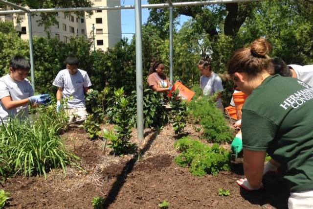 n the past few weeks, we had been working towards creating a mascot for Hermann Park Conservancy. However, after meeting with the staff at Hermann Park, we were inspired by the stories they told us about their interactions with the park visitors. Learning about these genuine and unique stories, we decided to change the direction of the project. Instead of moving forward with designing a mascot, we decided to focus on finding a way to encourage people to interact with the gardeners, who are critical for the sustainability practices in Hermann Park. We believe increasing these types of interactions, would start to solve the disconnection between HPC and park visitors.
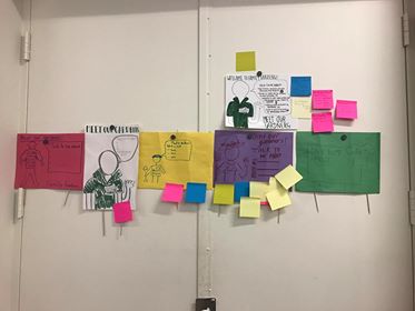
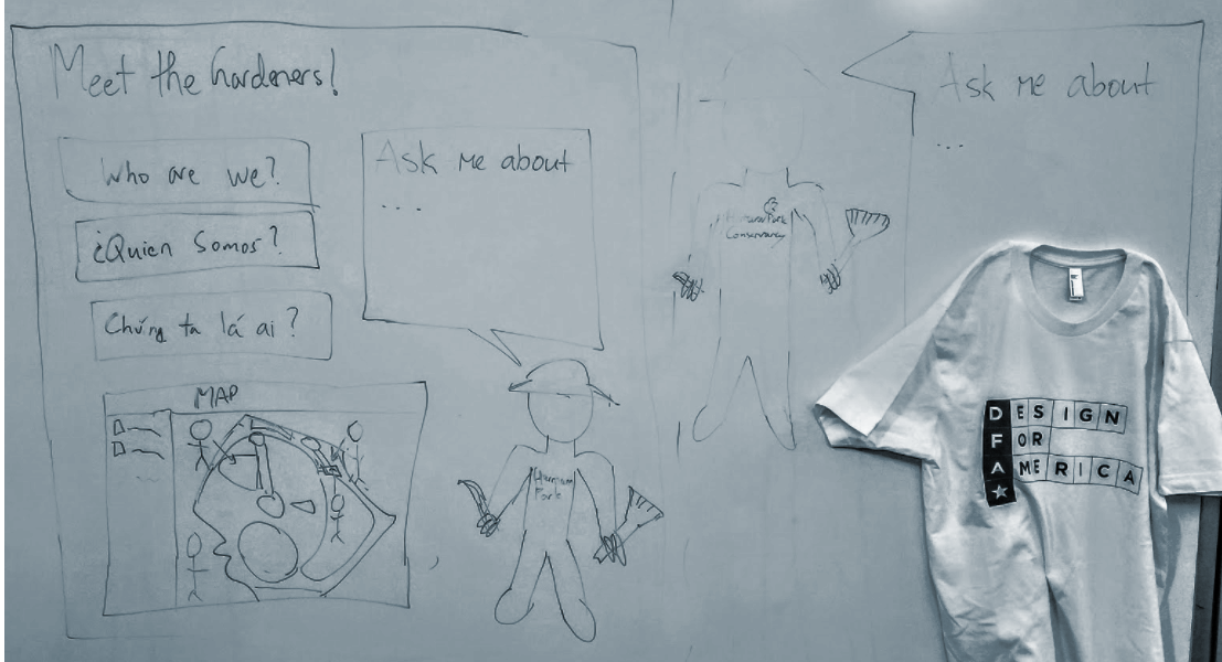 Our first prototype contained a set of signs. We wanted to have one larger sign that will serve as an explanation and introduction to the additional set of small signs in each garden zone . The first sign would include a job description, questions that can be asked to gardeners, a map locating each different sign and a drawing of gardeners with the Hermann Park t-shirt they all wear while working. On the other hand, the smaller sign would only have the questions/ “ask me about” portion and the drawing of a gardener. After sketching out our fist prototype, we wanted to test it with the ope studio members.
Some of the questions we’ll were seeking answers included the following:
- How many people will read the signs?
- How much do people interact with HPC gardeners after reading?
- How much content/text do you want to see?
- How willing are you to read the sign?
- How willing are you to talk to someone after reading the sign?
- How big should signs be?
- What part of the sign would motivate you to engage?
After testing through a set of questions and receiving general comments of studio members. Three important feedback we received were that simple is better, the sign should be inviting, rather than forcing interaction and the map makes it seem like the gardeners are part of an exhibition. This feedback helped us realize that we do not really need the larger sign and only should focus on the smaller signs that has more capability of starting conversation. Additionally, we decided to focus on one zone instead of multiple and chose the Family Gardens in Centennial Gardens as a site for our sign.
In our second round building, we decided to focus on the content and layout separately. Each group member sketched out their vision of the sign. After having a group discussion we also sketched one sign that combined our favorite ideas from each sign. In these iterations, we focused more on the layout.

Additionally, we drafted an outline of what type of bullet points we could have on the signs. Using these guidelines we decided on the bullet points we wanted to test on. During open studio we specified each bullet point and made a prototype that focuses on the content. 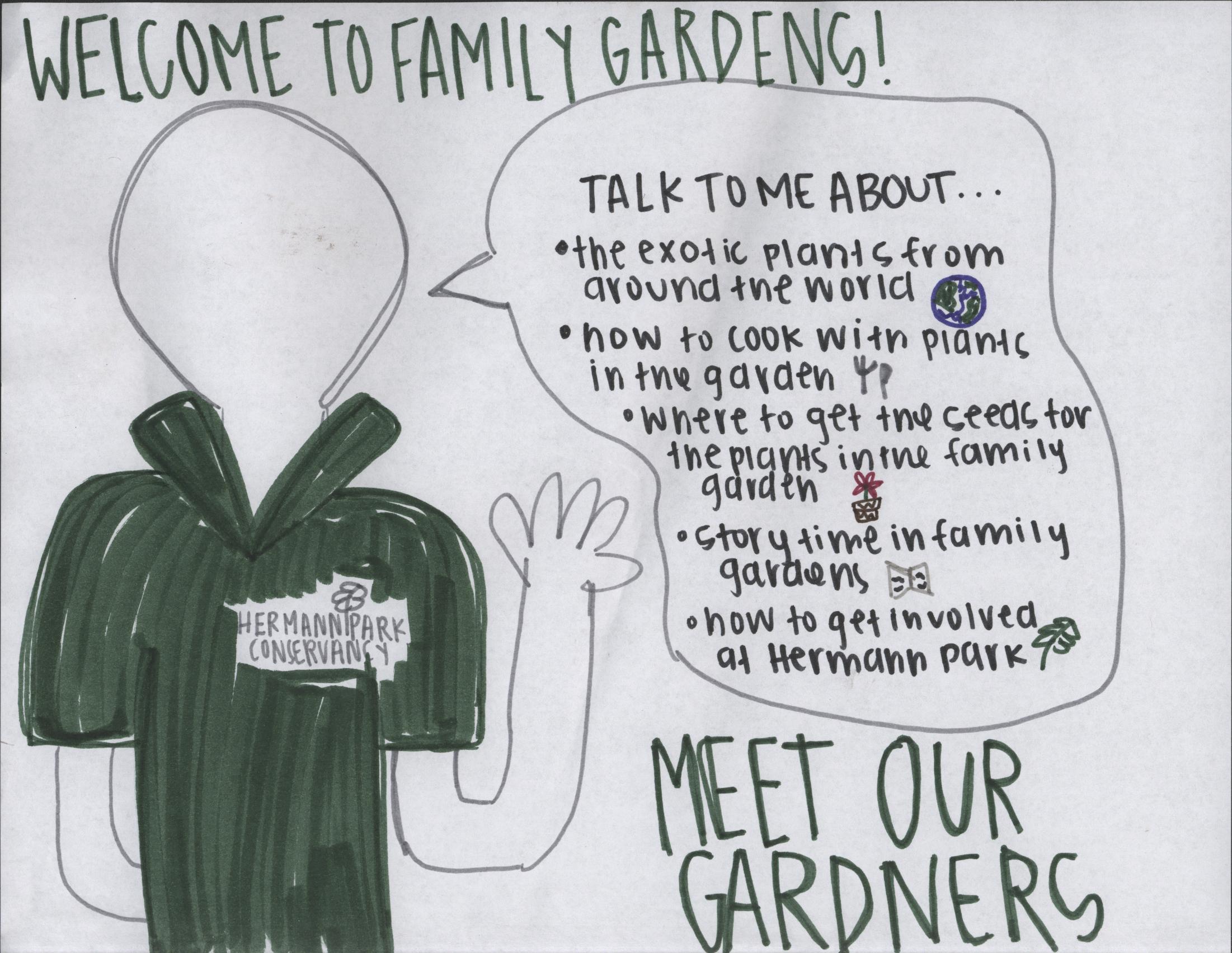
-
-
-
- Ask me about the different parts of the world represented in the Family Garden
- Ask me where to get seeds for the XYZ plant
- Ask me how to use the XYZ plant for making ABC dish
- Ask me about ABC Family Garden Event where you can learn more about the plants and how to get involved
-
-
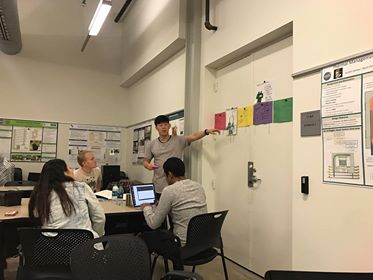
During open studio, we conducted two different type of tests. First we asked people which layout they preferred and why.Then, we asked their opinions about the bullet points we had. Through these tests we received important feedback on both layout and content. In terms of layout, people preferred landscape orientation and friendlier sketches of the gardener that contained accessories, like a hat with flowers. Additionally, we received positive feedback on the using icons as bullet points. The signs without the speech bubble were also favored, because the speech bobble disturbed the layout. In terms of content, we received feedback on the order of our bullet points and realized the importance of phrases that lend them to conversation, rather than things that can be found online. Additionally, the open ended bullet points received better feedback, because it felt less like a savager hunt. Something that we were advised to revised was also the topic sentence “meet our gardeners”. Although our intention was to create a feeling of unity by using “our”, through testing we learned that it was seemed possessive. Therefore, we decided that “meet the gardeners” could be more effective.
After this round of testing, we started to built our third prototype for the final review. In addition to all the revisions we had, we also wanted our sign to engage with the existing architectural qualities of the site more. We observed that the family gardens contained dark wood texture. Therefore, we decided to make our sign out of wood. Also because we were using wood, we wanted to score our design on the wood with laser cutter, so the drawing of the gardener would be more like a line drawing then an illustration. We also visited the site, and chose locations, the sign can be placed. We first, design the sign electronically, then tested on wood.