Having presented our progress so far to the rest of the studio at Midsemester Review, Team Switching Gears moved on to the Build stage of the human-centered design process. We initially brainstormed together and discussed what was important to include in each item. Then, later that week, Connor and Ashton prototyped the pamphlet while Scott and Elise tackled the poster.
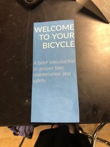
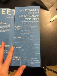
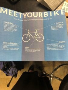
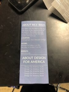
At that time, the pamphlet had three main components: a table showing what maintenance should be done after certain time intervals, a simple diagram of a bike with corresponding maintenance tips, and an information page about Rice Bikes. Below are photos of the first iteration of the pamphlet:
While the pamphlet is meant to convey fairly detailed information, we decided that the poster should be more general so it can be read completely while someone locks up a bike at a bike rack on campus. The most difficult parts of making the poster were getting the background to be the same blue as the Rice Bikes logo and ensuring that the map was understandable. Our passion for bike safety is unfortunately not matched by our knowledge of graphic design. We figured it out eventually, though, and here is the result:
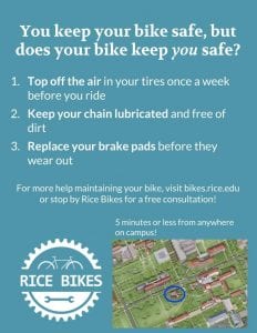
The image above is not the original iteration, but rather the one with post-testing alterations. These tests and alterations will be addressed in later blog posts. If you want to see our final prototypes in person, stay tuned for information on Final Review, which is coming up soon!
